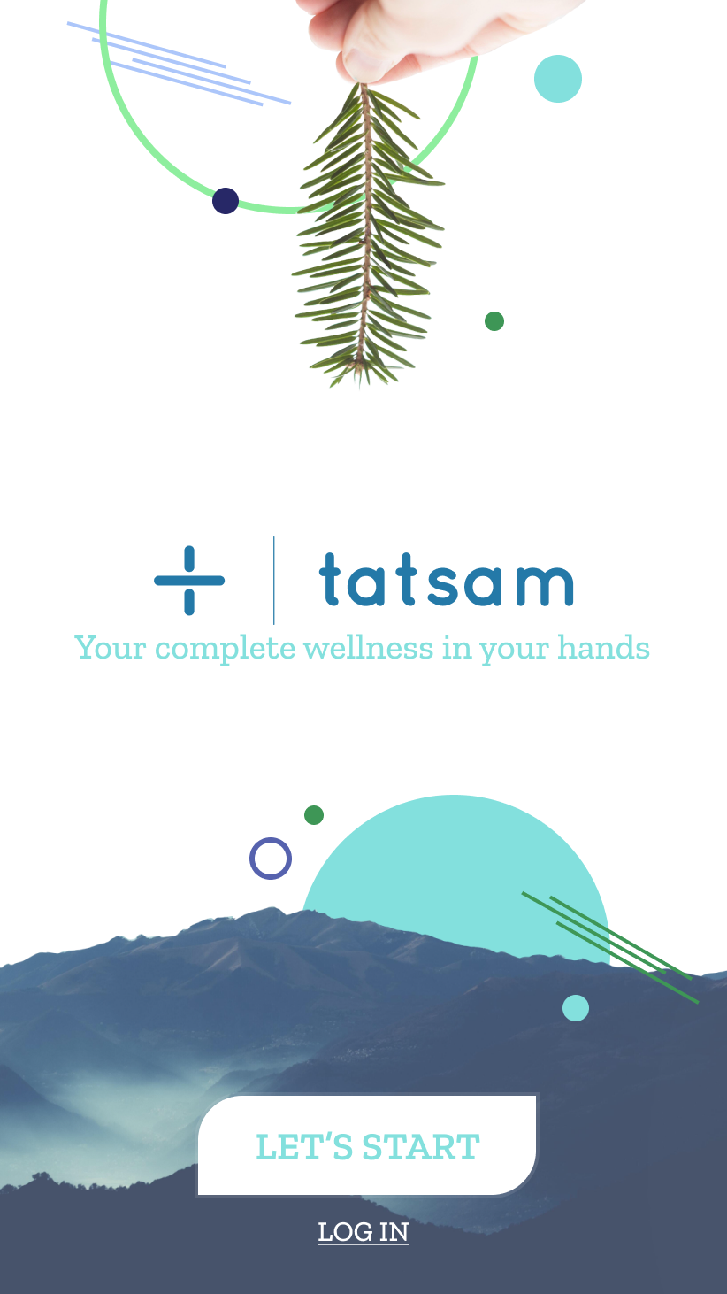
A wellbeing app that asks how you feel — then hands you something to do.
We designed Tatsam's whole product surface, code-ready: an onboarding that actually listens, two ways through (self-driven or guided), a recommendation engine, and a library of things to play and do — plus the marketing site that explains it in one scroll.
the app
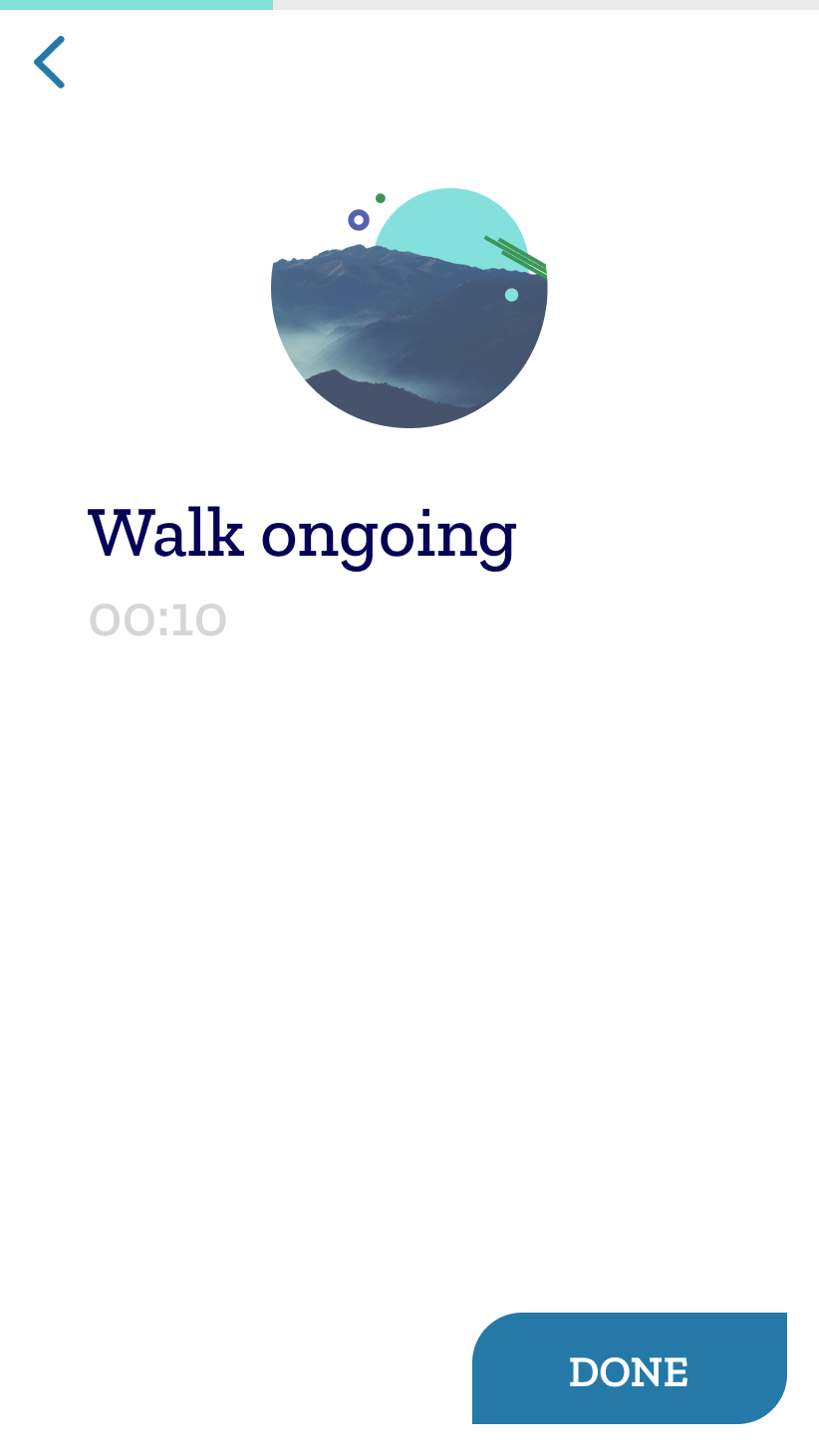
From "how are you, really?" to a next step.
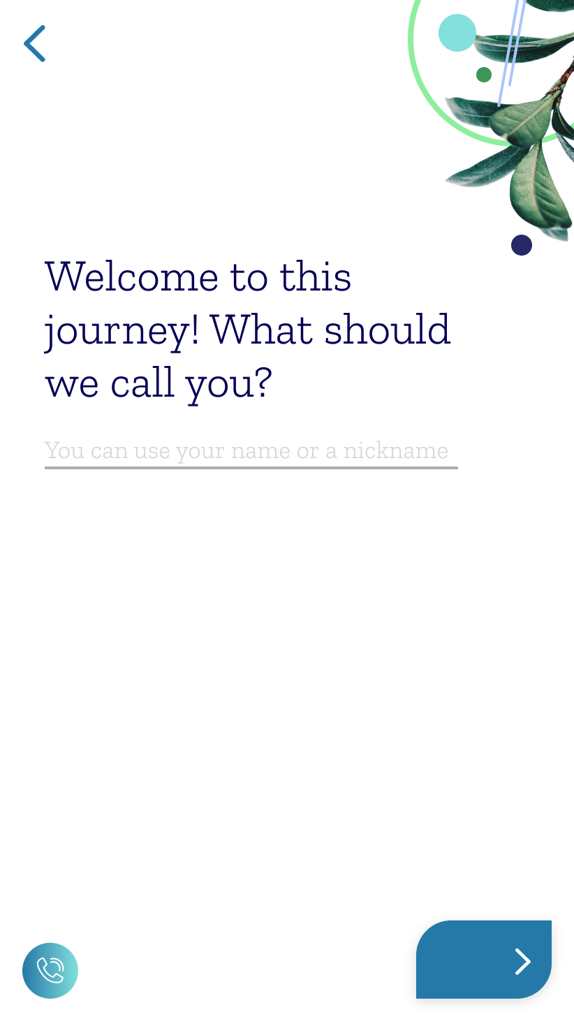
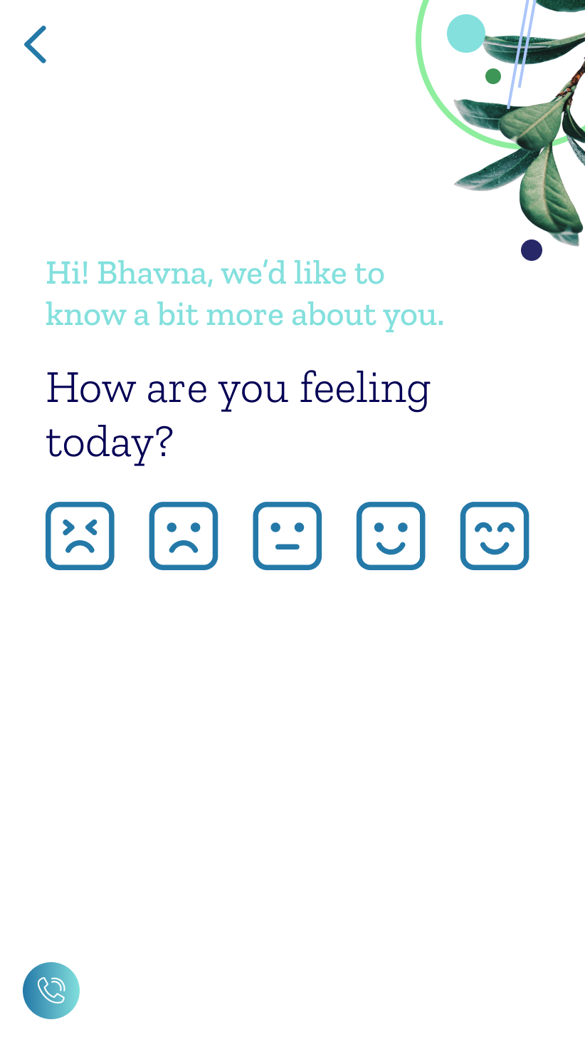
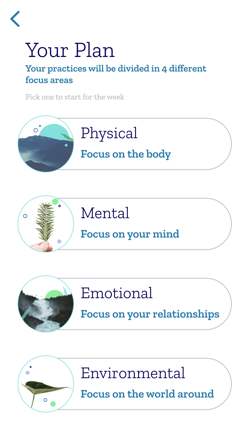
Onboarding asks your name, your time, and how you're feeling — then an interactive intro builds rapport before the product asks anything of you. From there, a recommendation hands you a single, doable thing.
Onboarding · name / time / feelingInteractive intro & rapportSelf-driven vs guided pathsRecommendation enginePlay & do-now sectionsProfile & tracking
OpeningOnboardingHow you feelYour pathPlay / do now
The whole flow is built around one belief: the smallest doable step beats the perfect plan.
the website
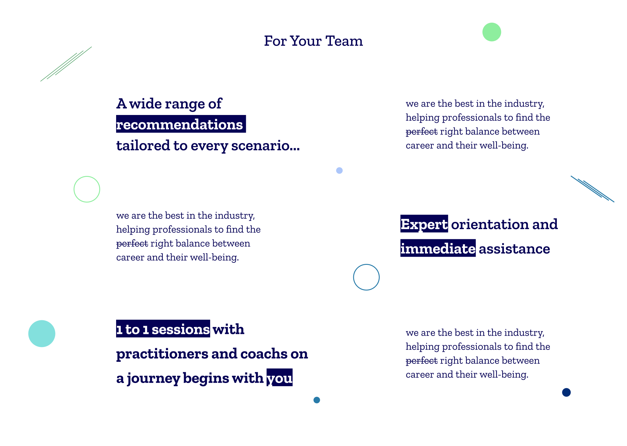
And the site that brings people to it.
The marketing site lands the promise — "Holistic wellbeing for modern professionals" — in one scroll: what you'll have, what you'll find, and the exercises themselves, shown on-device.