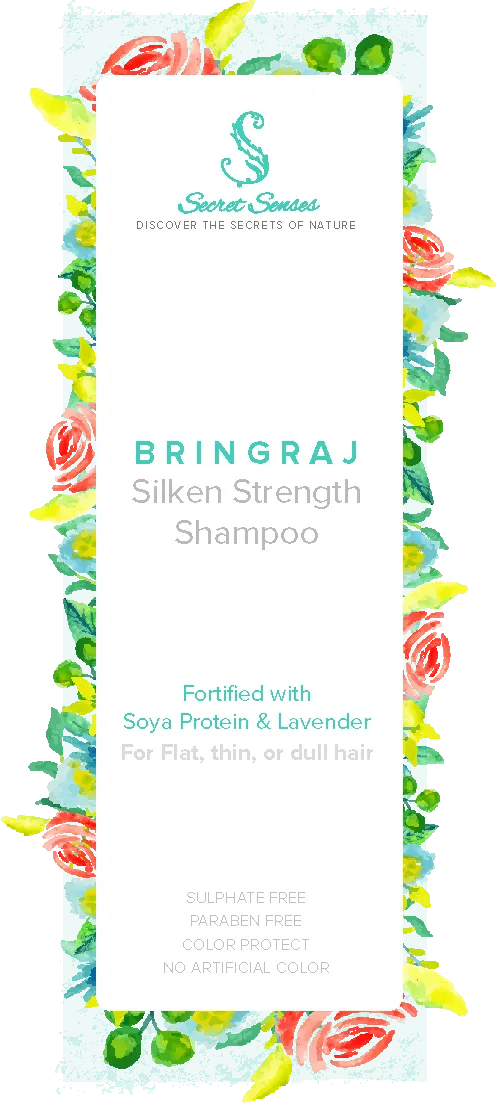
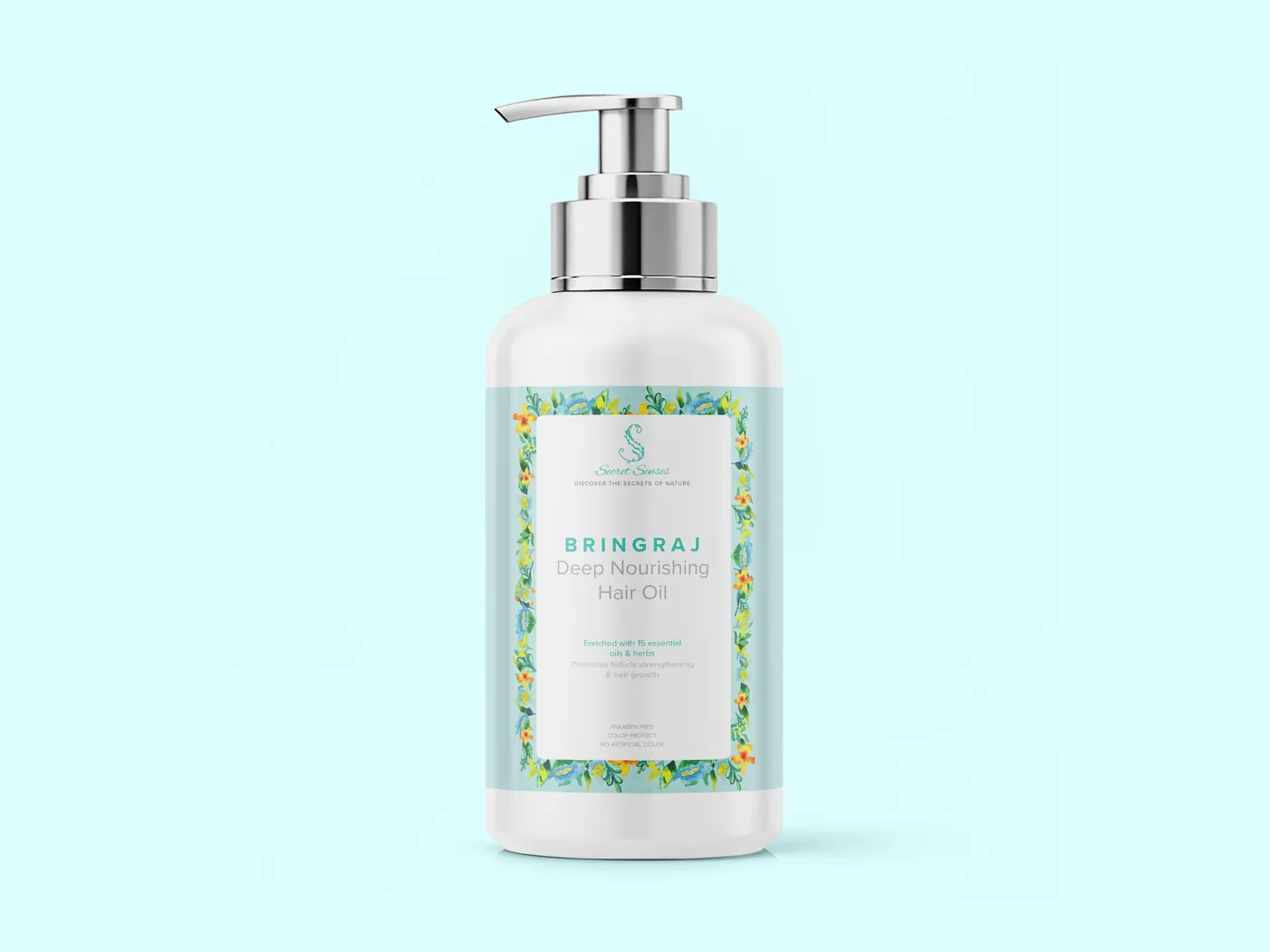
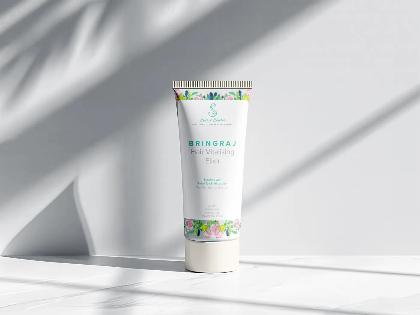
Scroll to watch one watercolor flower multiply into a pattern that covers every bottle in the Secret Senses product family.
how the system grew
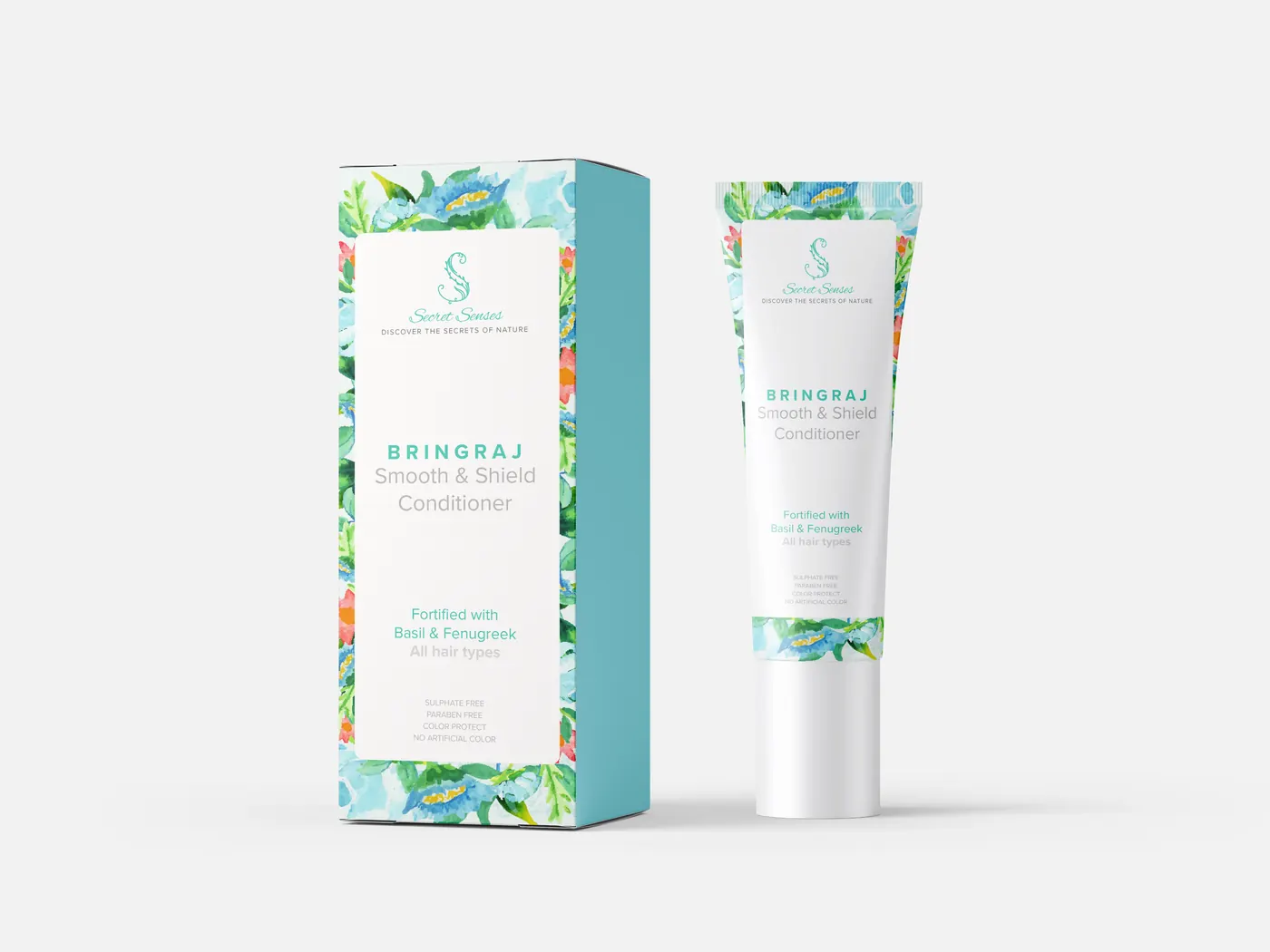
Scroll. The same flower, over and over, until it is the packaging.
Scroll to watch one watercolor flower multiply into a pattern that covers every bottle in the Secret Senses product family.
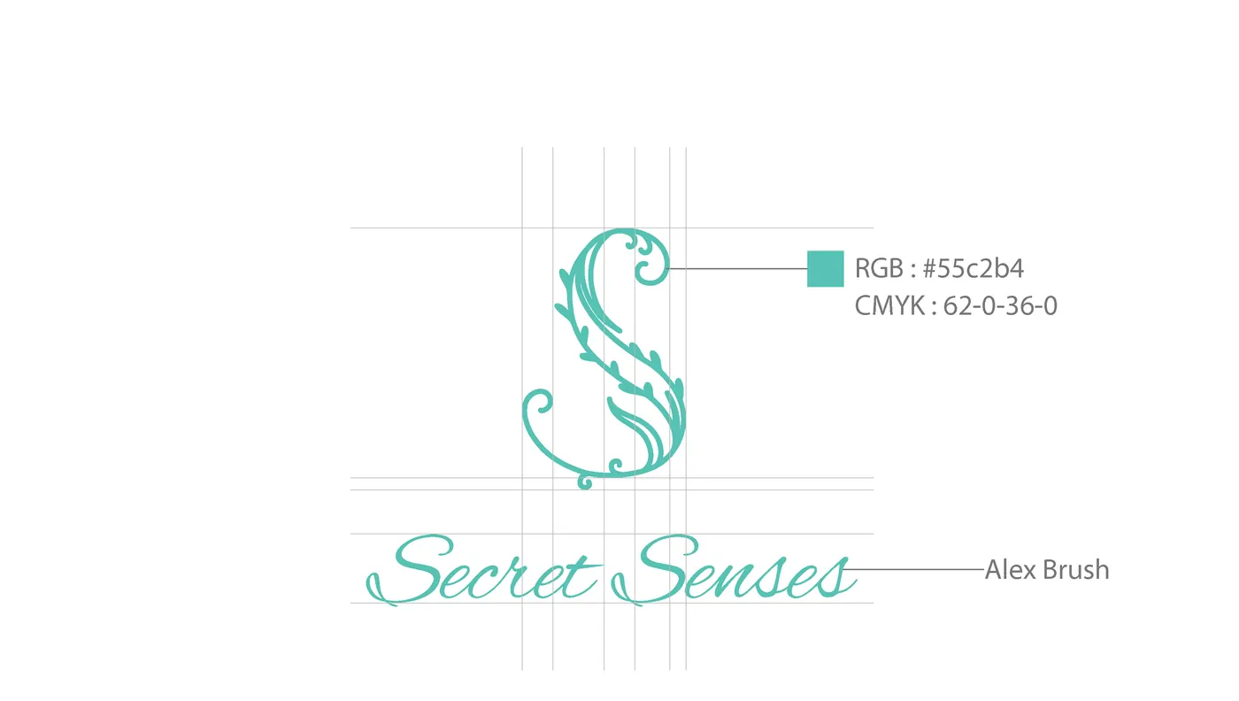
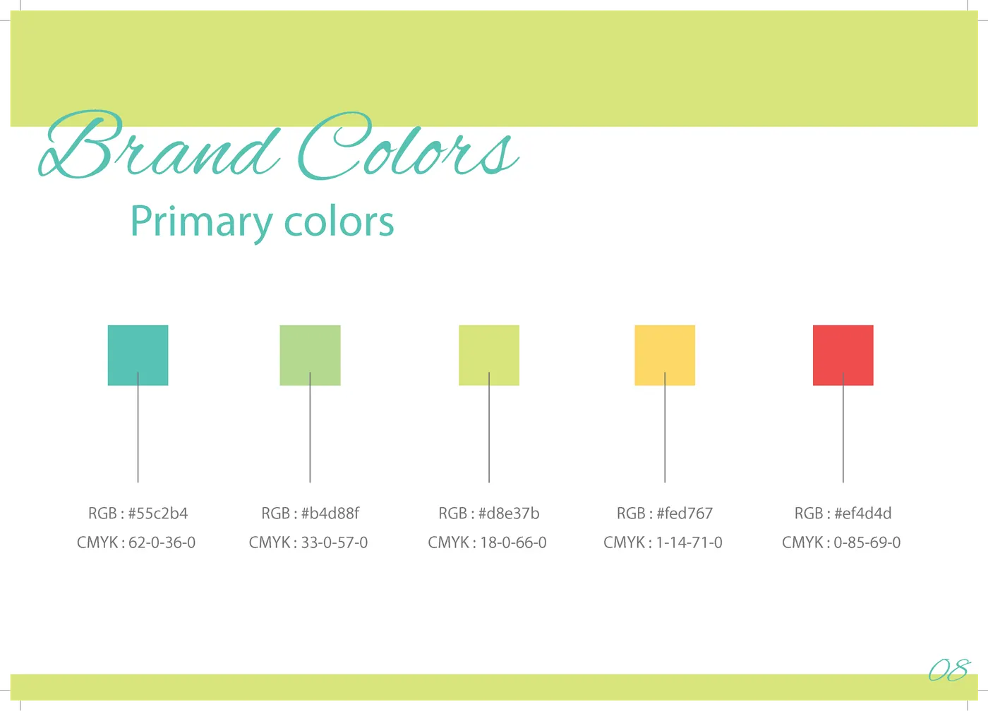
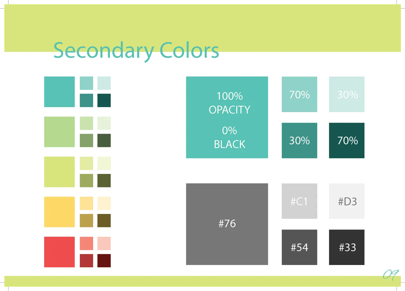
a mark, and a palette to hold it all.