Digital provider to small restaurants in Hong Kong with a strong personality needing a strong brand identity.
Moodboarding
Branding
Media Guides
Hong Kong10–25 employeesBootstrapped
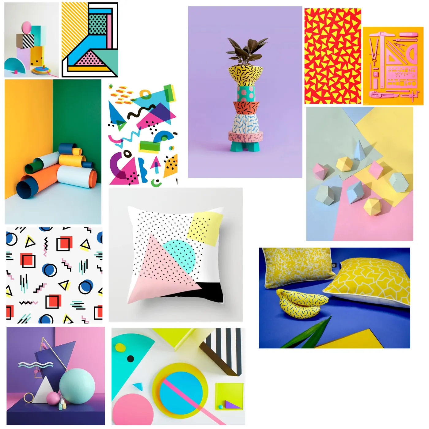
memphis energy meets HK street
Gliitch needed a brand revitalization that would stand out in the colorful and diverse local market in Hong Kong, while supporting co-branding with all its small-restaurant customers online and digitally.
Balance vibrance & loudness across different axes — with adaptability.
bold colors
multiple primary colors for high energy
strong geometric shapes
supporting patterns
memphis-style design language
↓ now narrow it — the mark
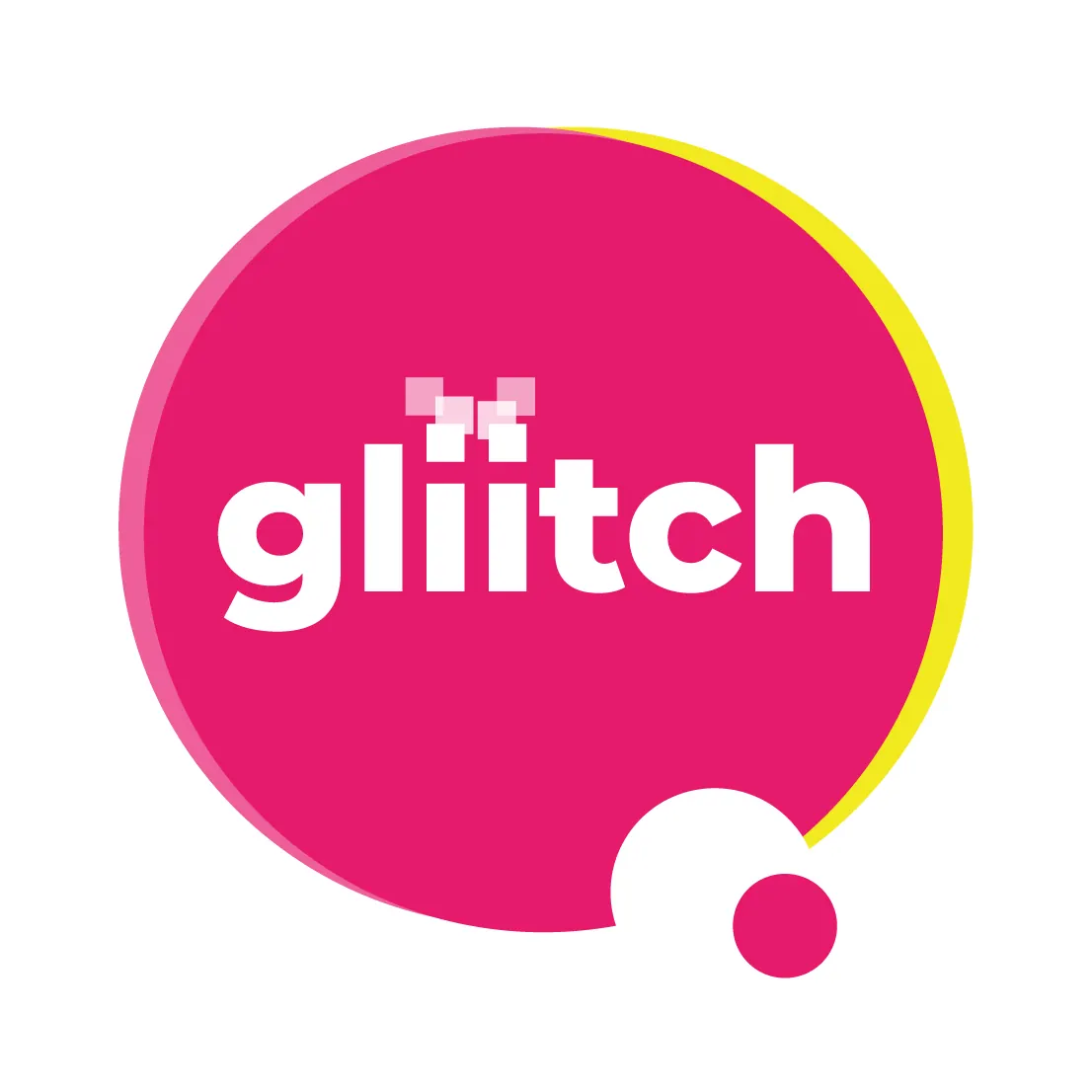
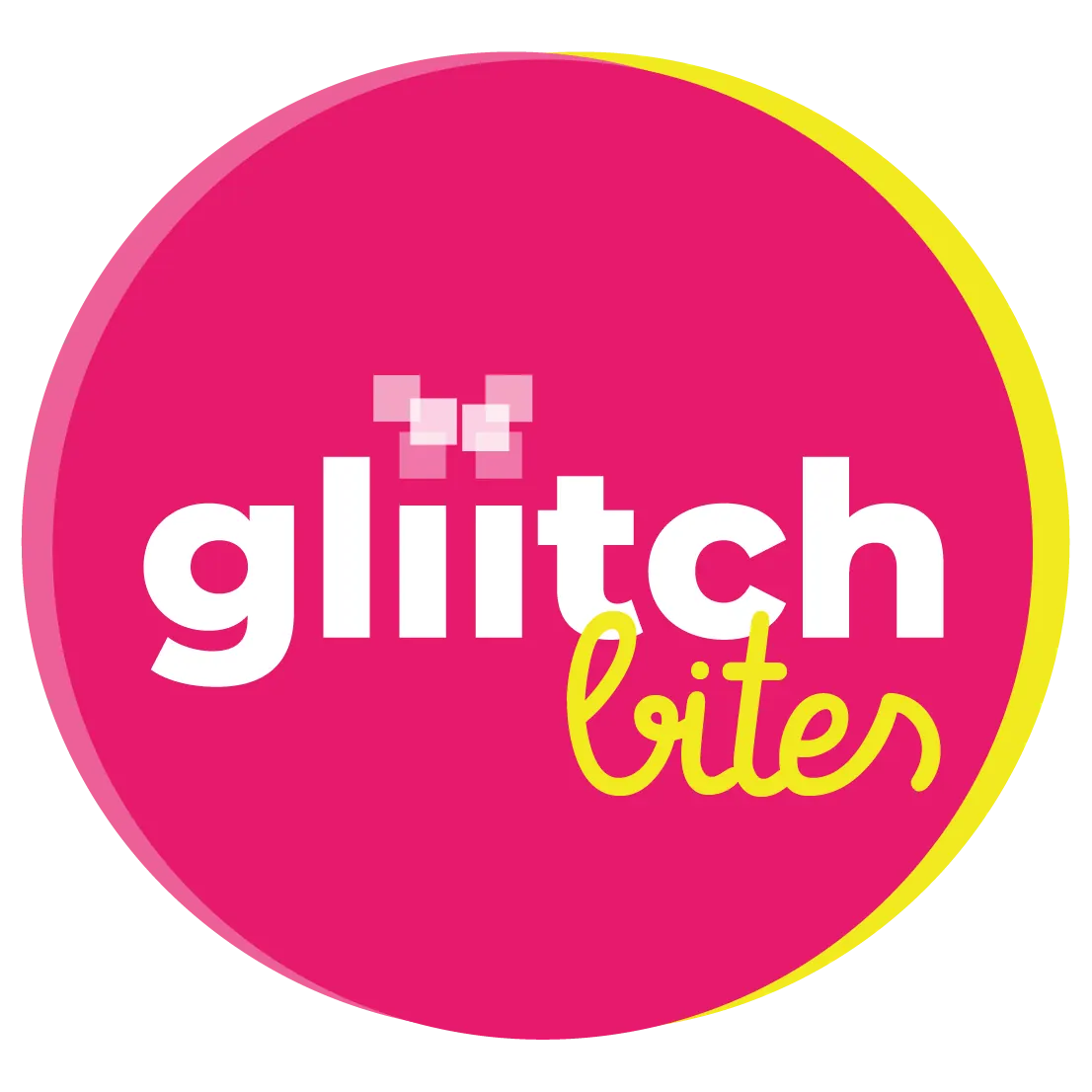
the logo we landed on
The new logo set the tone for the branding. With just two colors in the final version, the shapes allude to nostalgic emotional energies that stand out in the hyper-future-focused competitive market environment.
Logo candidates — explored across container, contrast and circular forms.
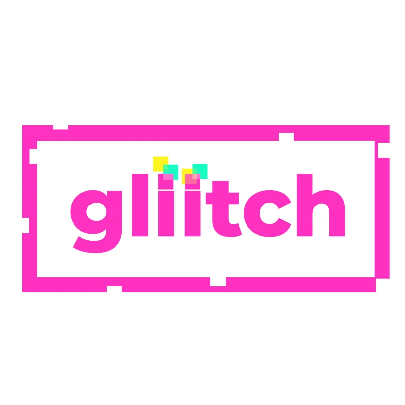
container
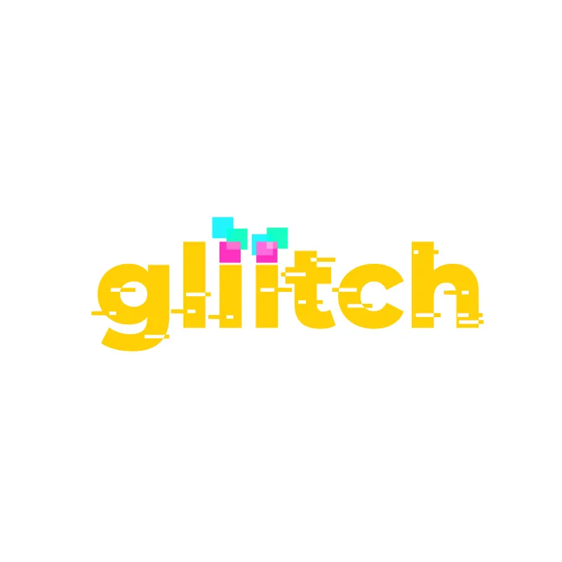
high-contrast broken / glitch effects
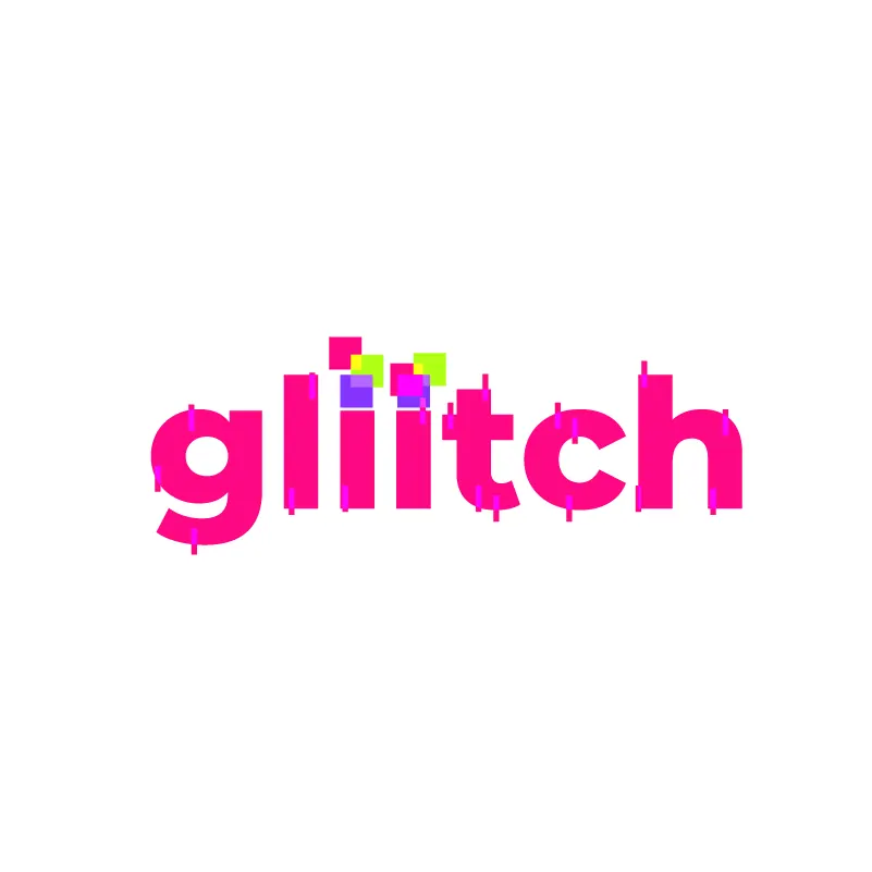
subtle-contrast broken / glitch effects
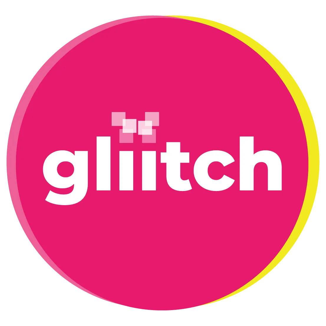
circular form, reminiscent of nostalgic TV logos
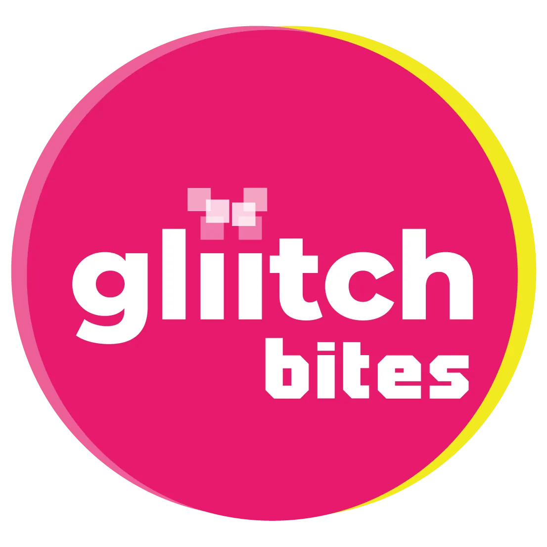
final logo — keeps glitch effects and nostalgia elements while supporting sub-brands
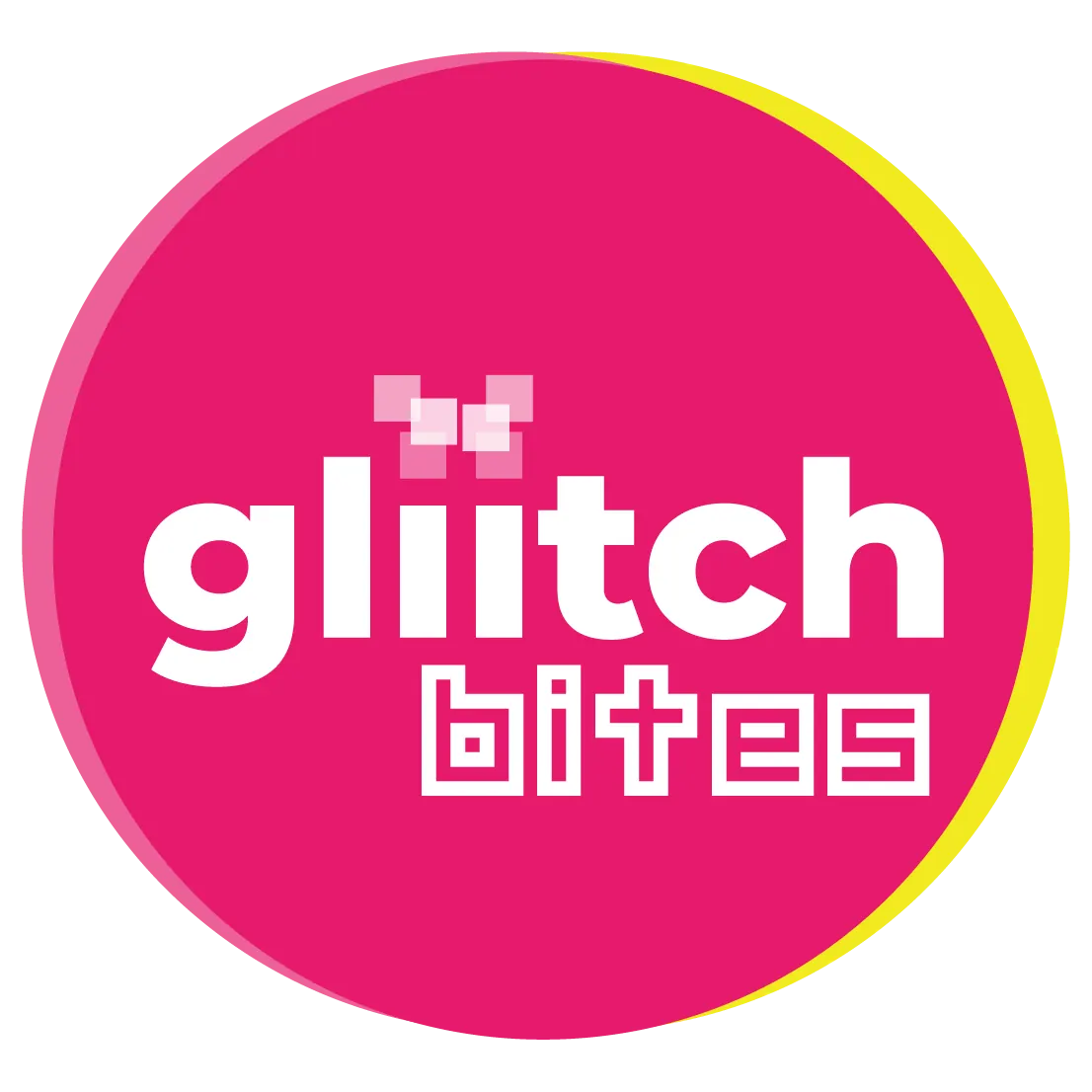
sub-brand logos are easily derived from the main logo
↓ then bring it to life — in motion
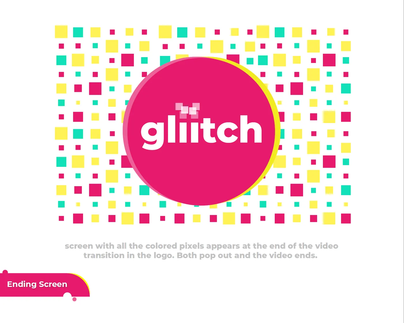
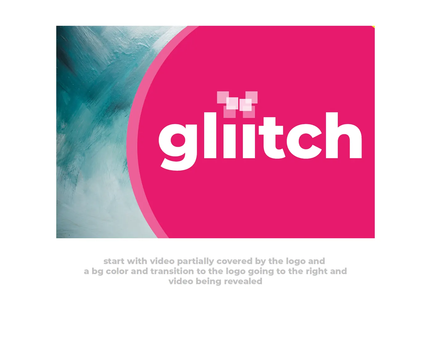
now it moves
Extending the branding to video brought a sense of play — with elements interacting with each other, and the view space, in a way that was impossible with a simple two-dimensional branding.
a sense of abundance from the closing screen animation, using colors and quick transitions
transitions let elements enter and exit the screen, heightening the sense of play and fun
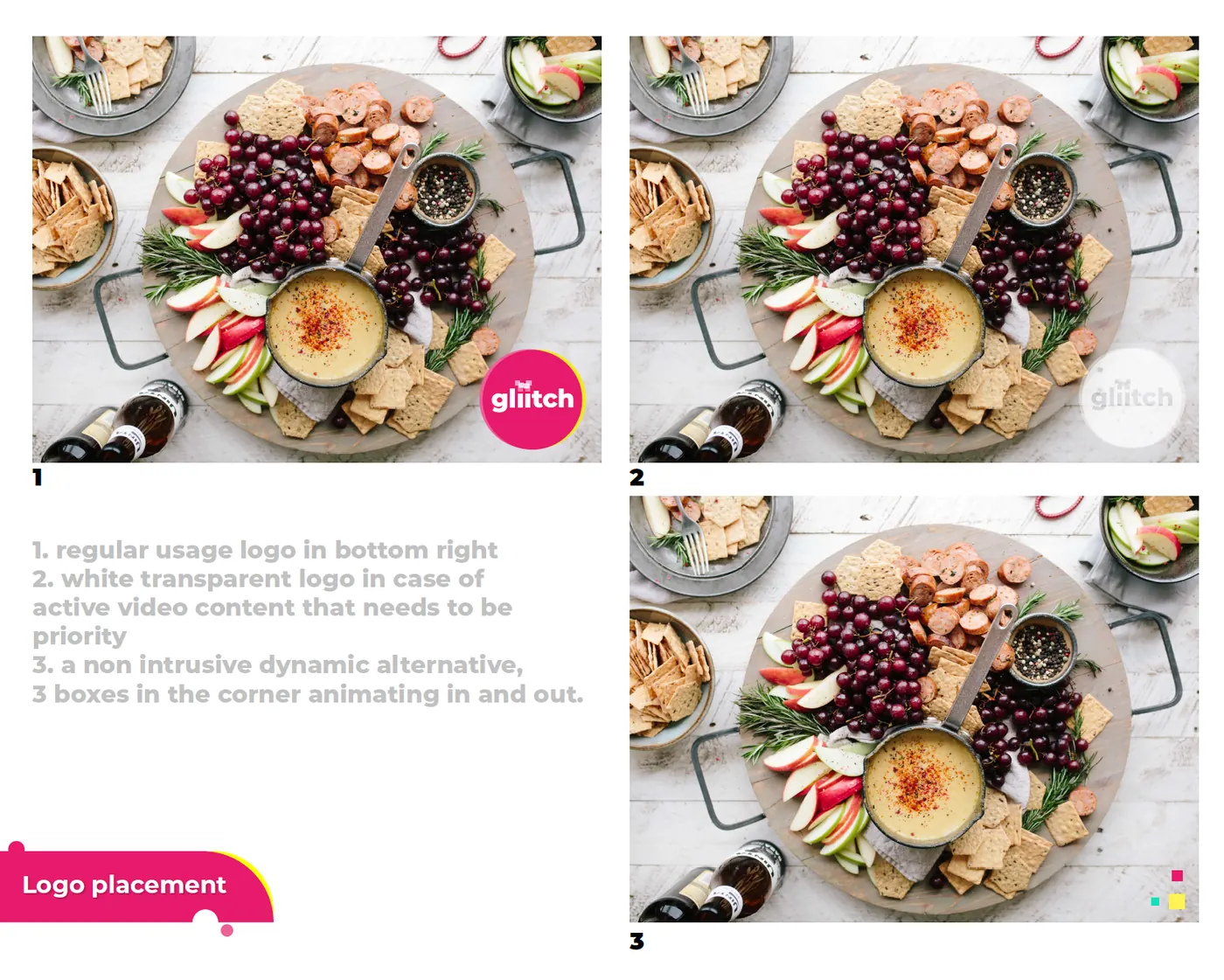
extending the branding to three dimensions dramatically increases edge cases, requiring different logo versions for chaotic visual scenes