Secret Senses

Project type
Branding and Product Packaging
Of note
Conveying handcrafted-ness of the brand through packaging
Connecting beauty and nature
For a brand that prided itself on the natural ingredients, we knew that we will need to do something remarkable to showcase what made the brand special, and the best way was to show the packaging the love and care it deserved.
We started the project with wanting to create a brand that had some visual motifs that felt connected to “indian"-ness” of the brand and also something that felt soft without going too heavily into the feminine side. And our moodboard reflected that.

The logo was heavily inspired by the henna designs that are made in India because the brand has a lot of herbal components, and the flowy font gave it the right amount of dynamism.

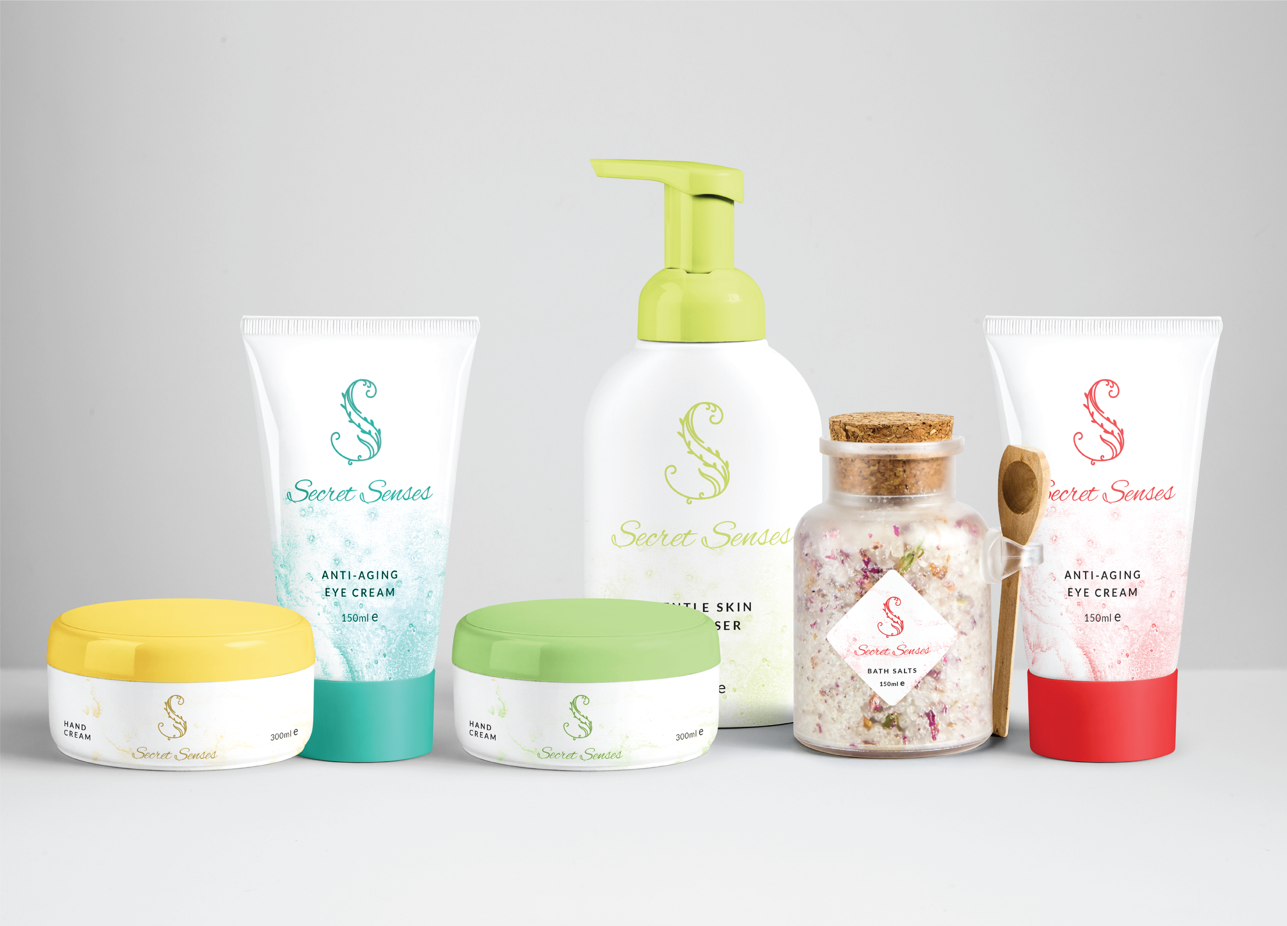
For the first round, we tried out some simplistic packaging options.
Just the logo with some marble texture and the various brand colors. It turned out to be too simplistic though. And did not have the personality that we expected the brand to have.


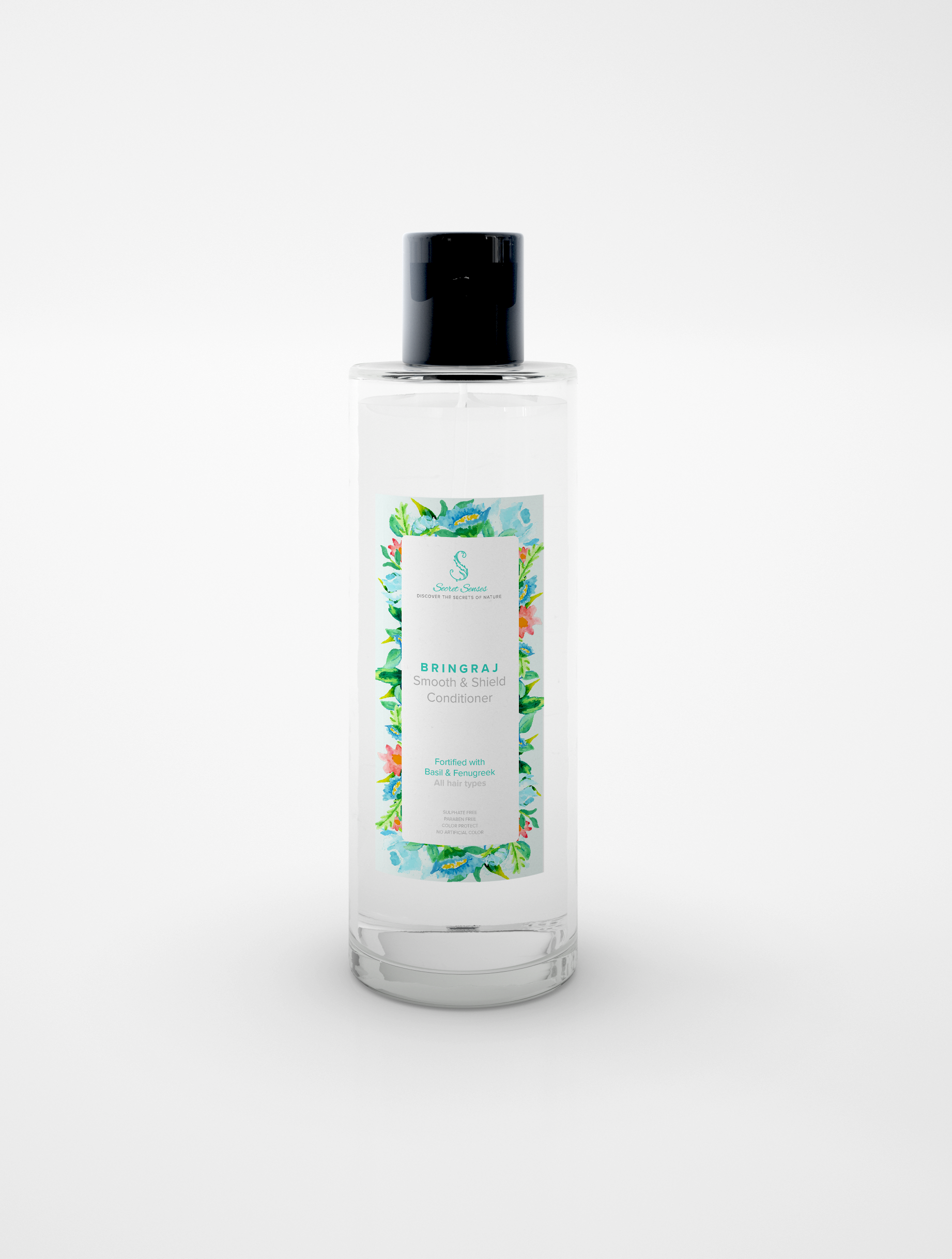
While playing around with my paints one day, and idea struck, that maybe we could explore visuals which are more organic and hand drawn. We used water colors to create some beautiful individual floral elements.
And then it was all just about combining these floral elements into beautiful arrangements together, and using them as labels for all the different products.


